Work/020/Concept study · App
Tarot Together
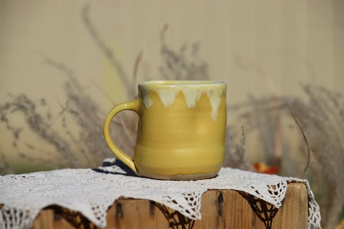
Tarot apps hand you the card meanings and leave you alone with them. Tarot Together pairs you with a mentor and a group to practise with.
Concept study. Designed during DesignLab’s UX Academy, not a shipped product.
- Role
- Sole product designer
- With
- A DesignLab mentor and 8 group critiques
- Project
- DesignLab independent project
- Tools
- Figma
01The short version
I designed a learning app around mentor sessions and practice with other learners, and tested it with 7 people.
The research and every screen were mine, with feedback from a DesignLab mentor and 8 group critiques along the way.
02Learners wanted company
Beginners and long-time readers kept asking for 2 things: a mentor and people to practise with.
I ran surveys and interviews with tarot learners, some brand new and some reading for years. Consistency came up too: people wanted help keeping a regular practice going.
03A gap on the shelf
The tarot apps I reviewed teach the cards well and Discord has the people, but none of them did both.
I looked at Galaxy Tarot, Labyrinthos, Golden Thread Tarot and Discord.
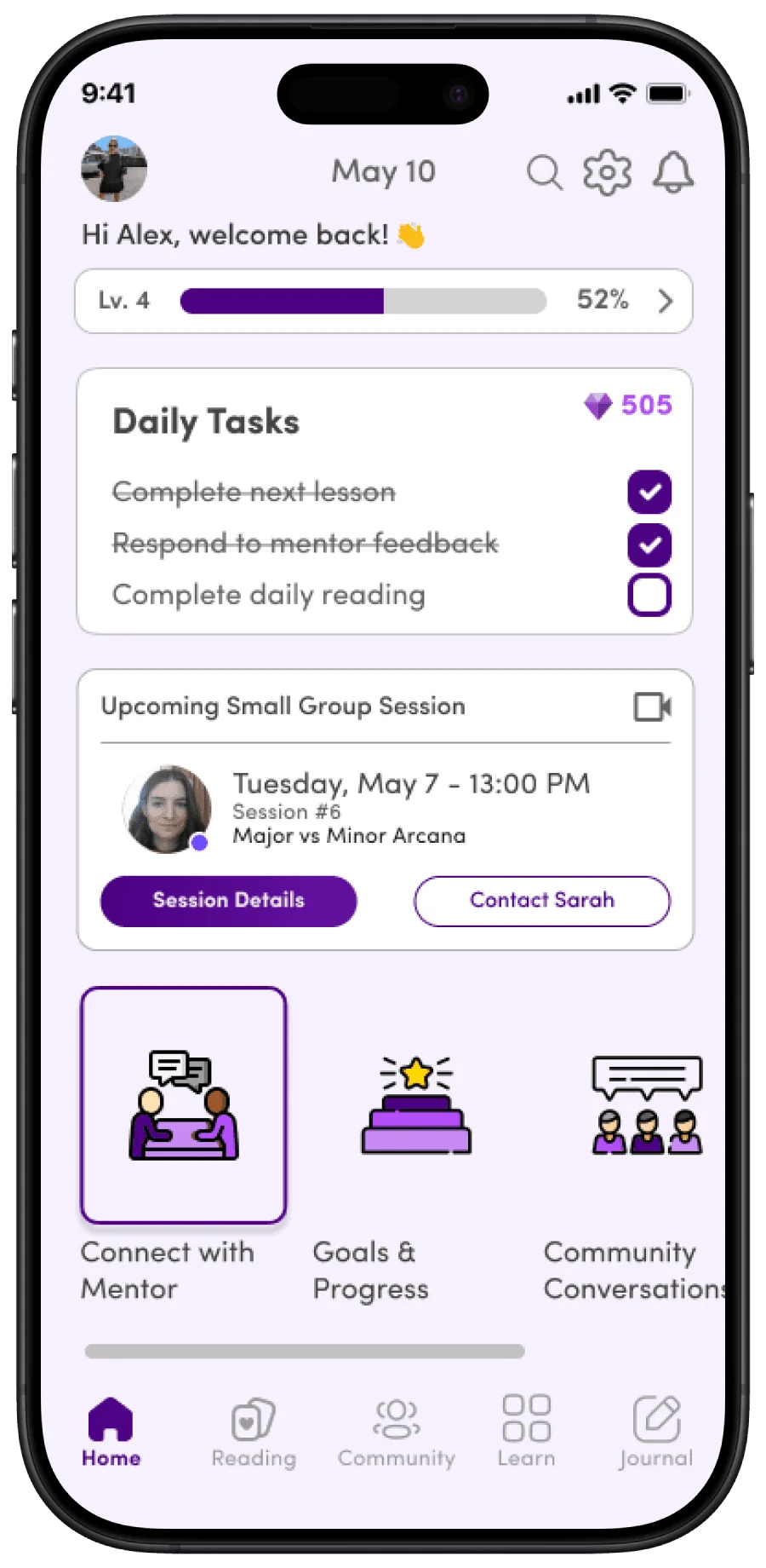
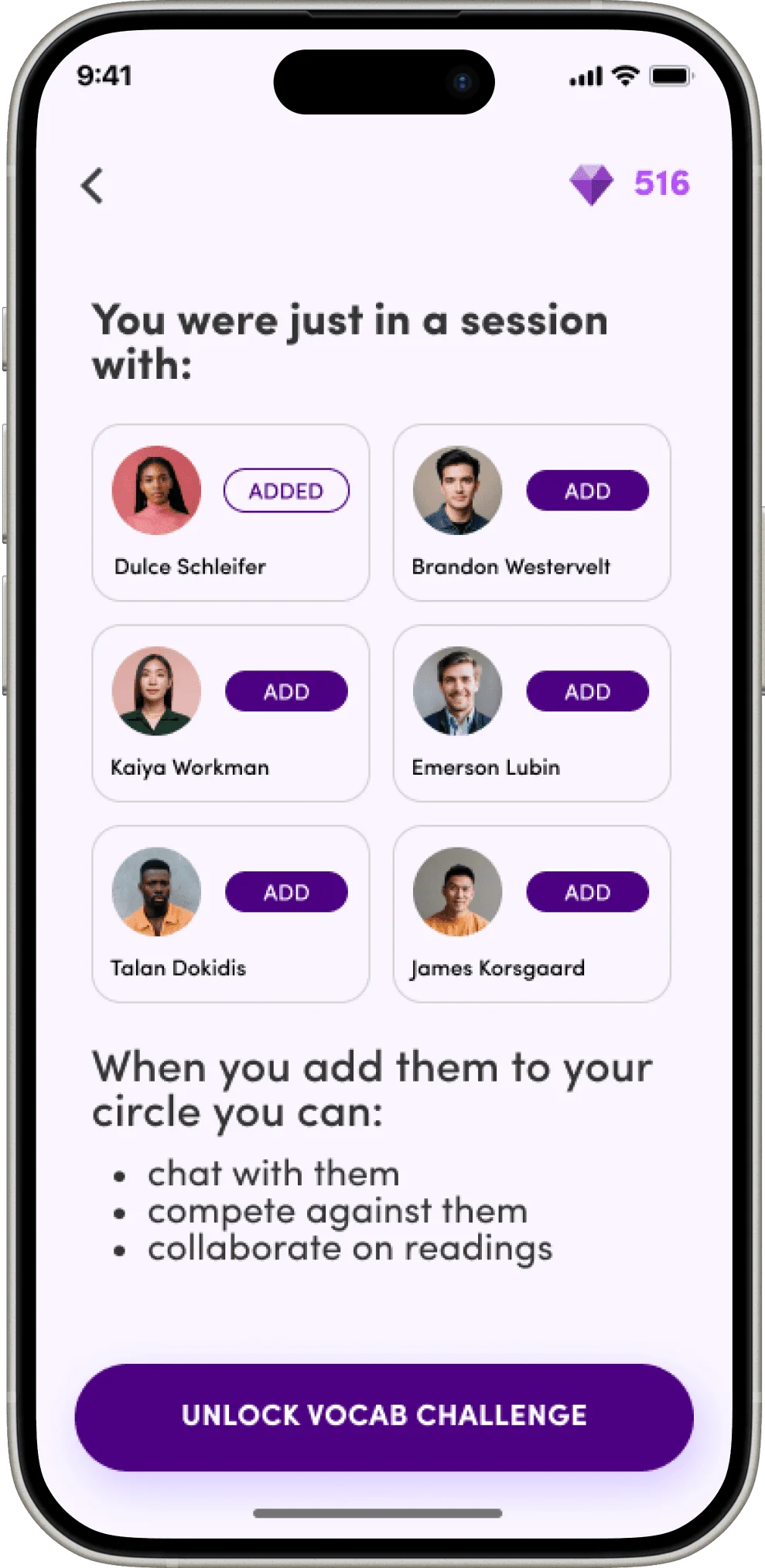
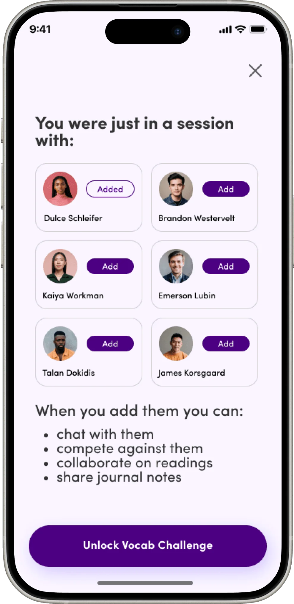
So Tarot Together puts lessons on the cards next to mentor sessions, and after a group session you can add the other learners to your circle.
04Testing the 7th visit
I set the test on a returning learner’s 7th visit because that’s where the community part shows up.
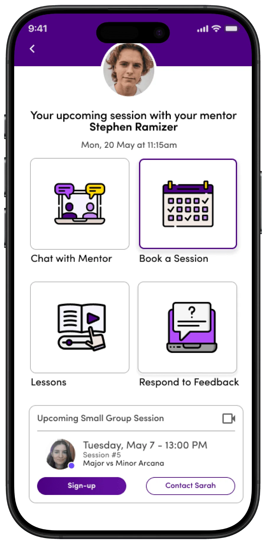
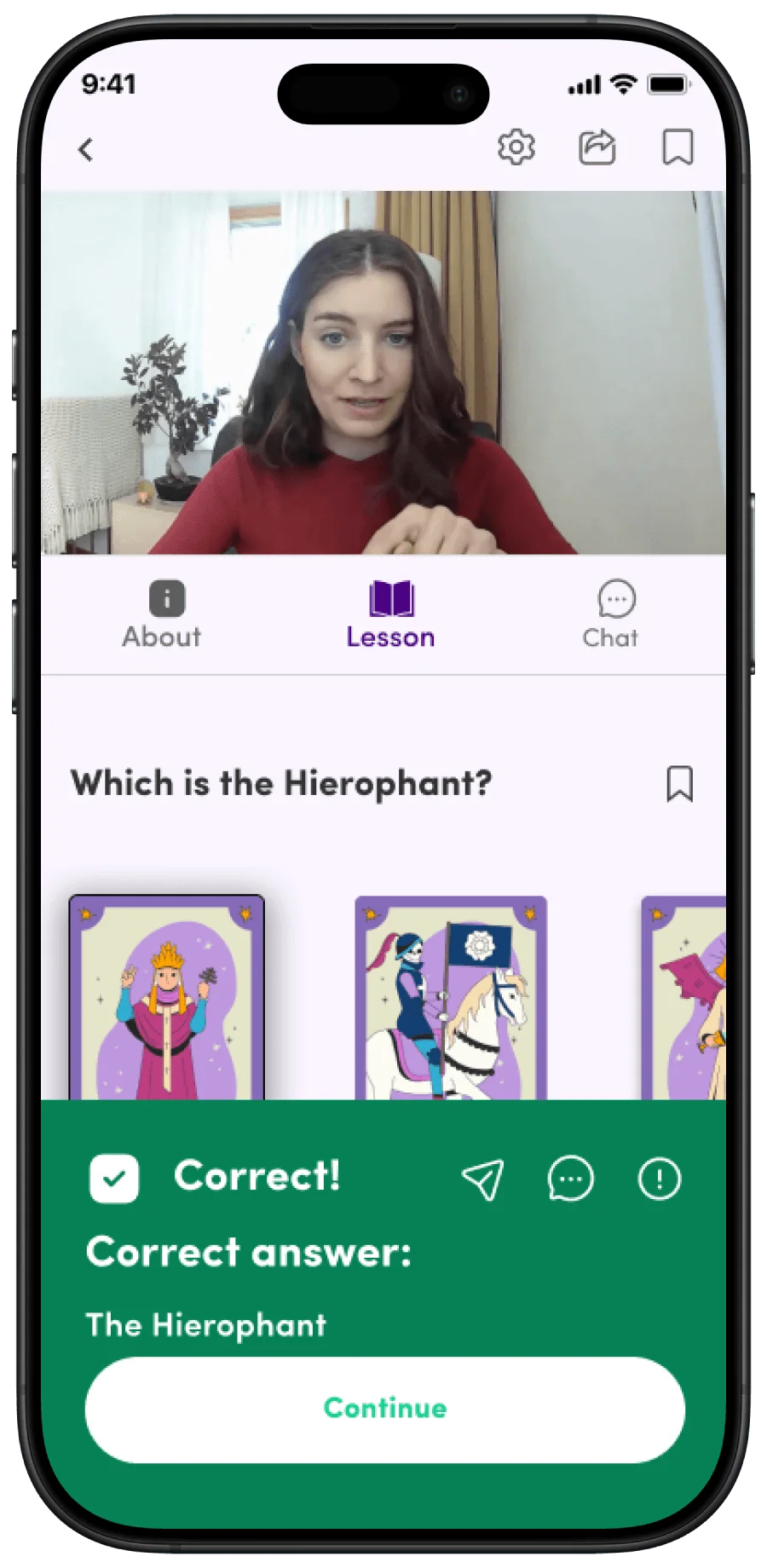
The script told each tester they’d already met their mentor twice and joined a few group video sessions. Today they had to book a new session with their mentor, then catch up on a lesson they’d missed live the day before.
05What 7 testers changed
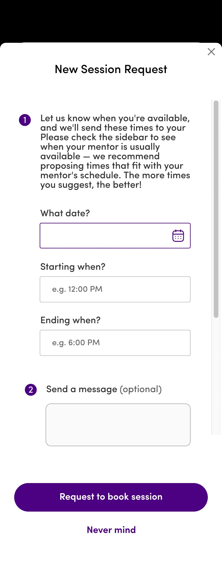
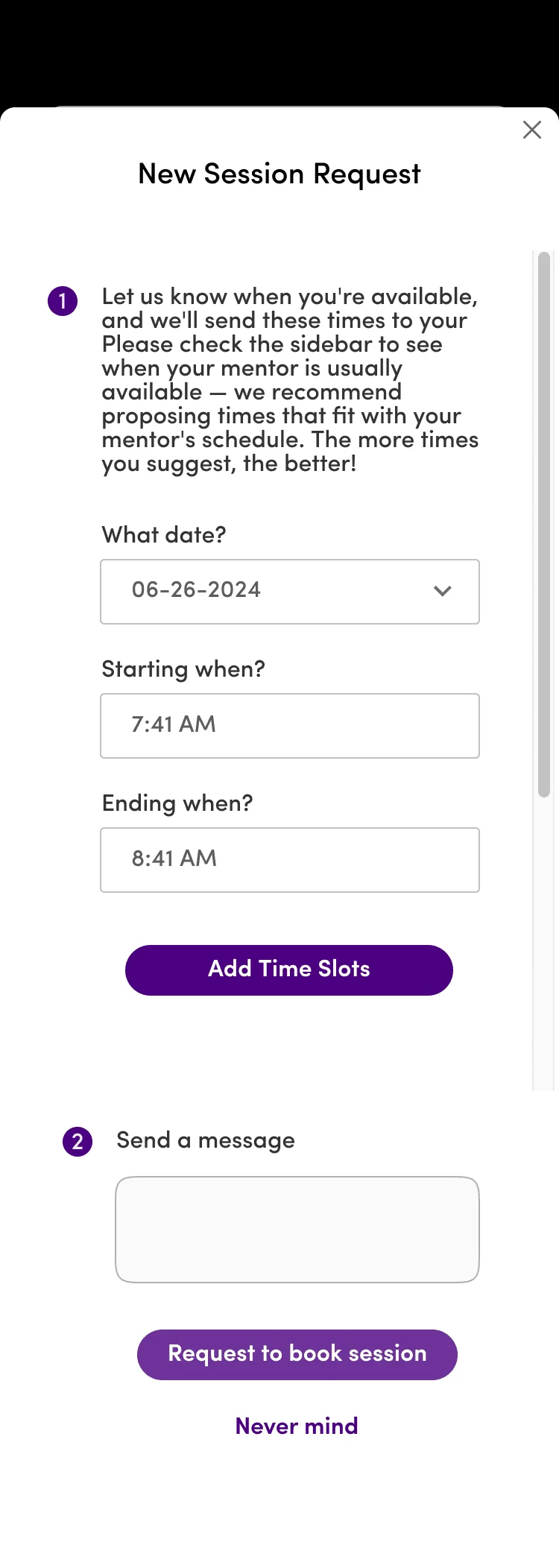
The time picker became a list of slots with a Confirm button.
Testers struggled to pick and confirm a time in the original booking modal, so the scroll wheel became a list of time slots, with instructions and a Confirm button.
They also felt stuck on the last screen of a lesson, so the back arrow and gem count at the top became a clear X that takes you home.
“I would use this app every day!”
Credits
Tarot Together
- Research and design
- Alex Jammali
- Mentor
- DesignLab
- Critiques
- 8 DesignLab group critiques
- Testing
- 7 testers
Concept study · App · DesignLab